Project Brief
The goal for this project was to create the visual identity and branding for a coffee company marketed towards people who enjoy outdoor activities such as Hiking, camping and cycling.
The audience for this project is people typically in the age range of 20-45 who enjoy both outdoor centred activities as well as premium coffee brands.
The personality of this brand is precise, understated and dependable.
however, the challenge for this design brief was to create the visual identity for this brand which combines both outdoor suitable utility with premium coffee branding, while avoiding outdoor visual clichéS, such as Mountains and pine trees. The final branding needs to display the outdoor personality of the brand while not looking overly manly (isolating the female audience) or too hipster.
The outcomes needed for this brand are:
Logo, wordmark, visual system, colour scheme, type system, advertising and product packaging including;
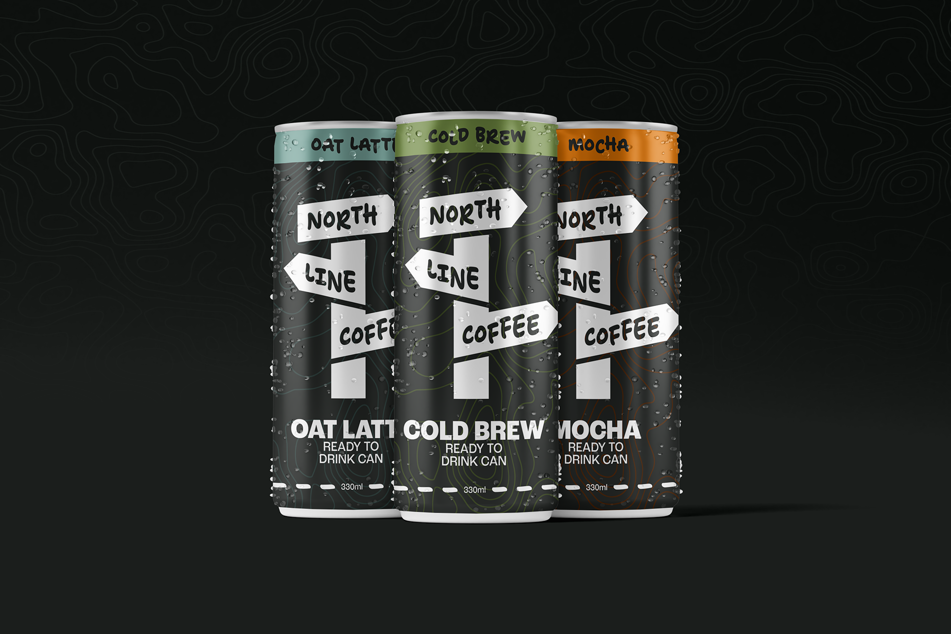
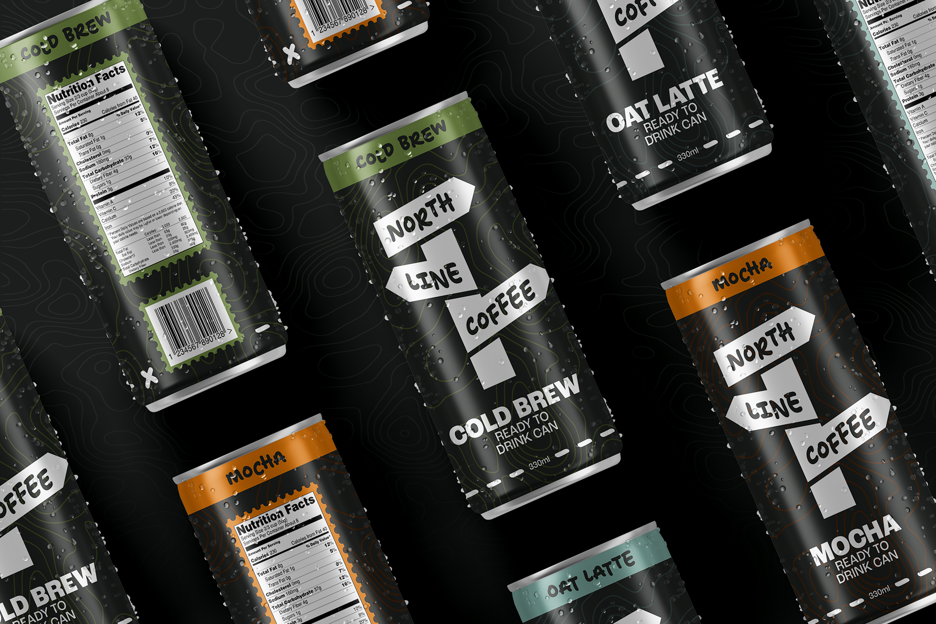
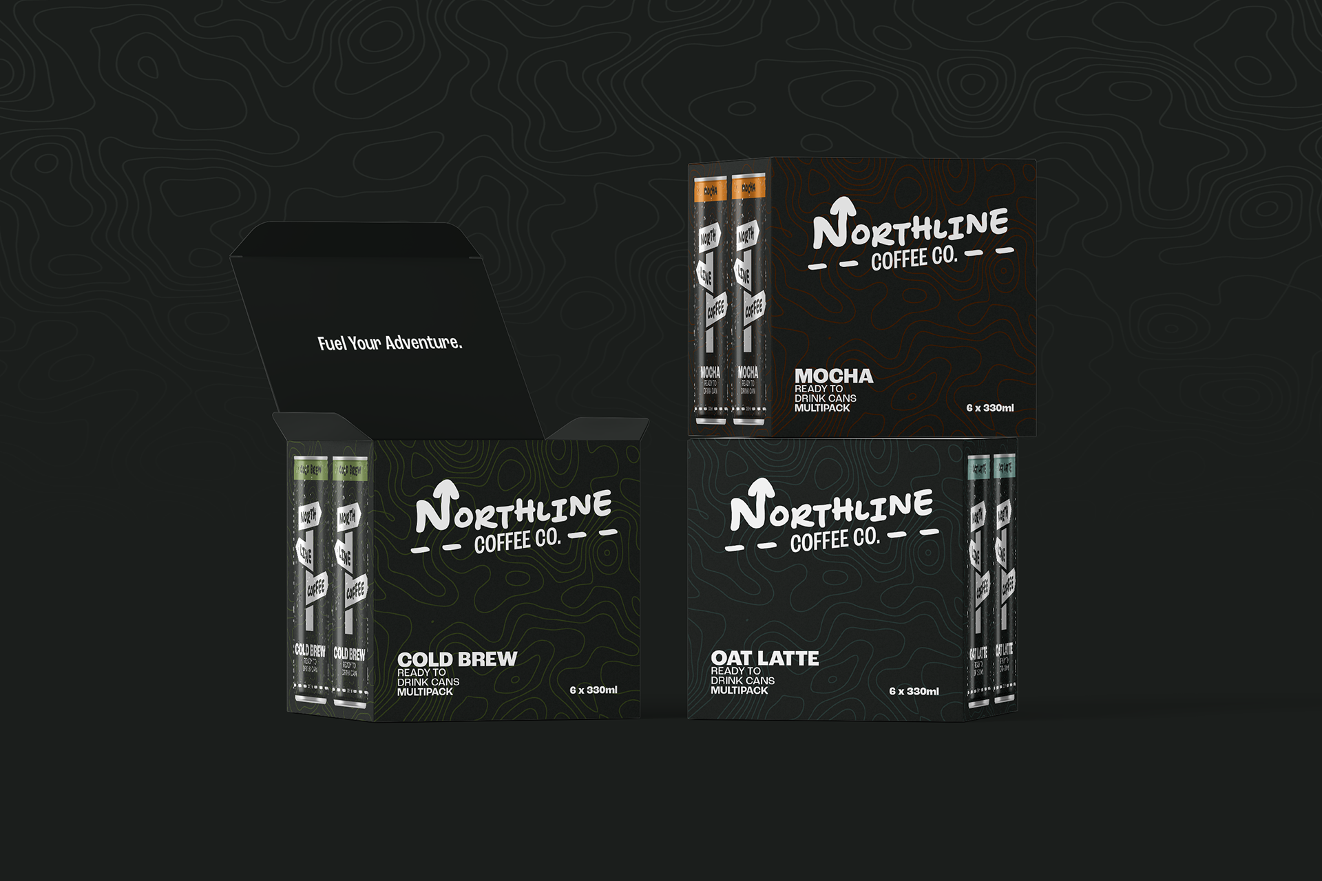
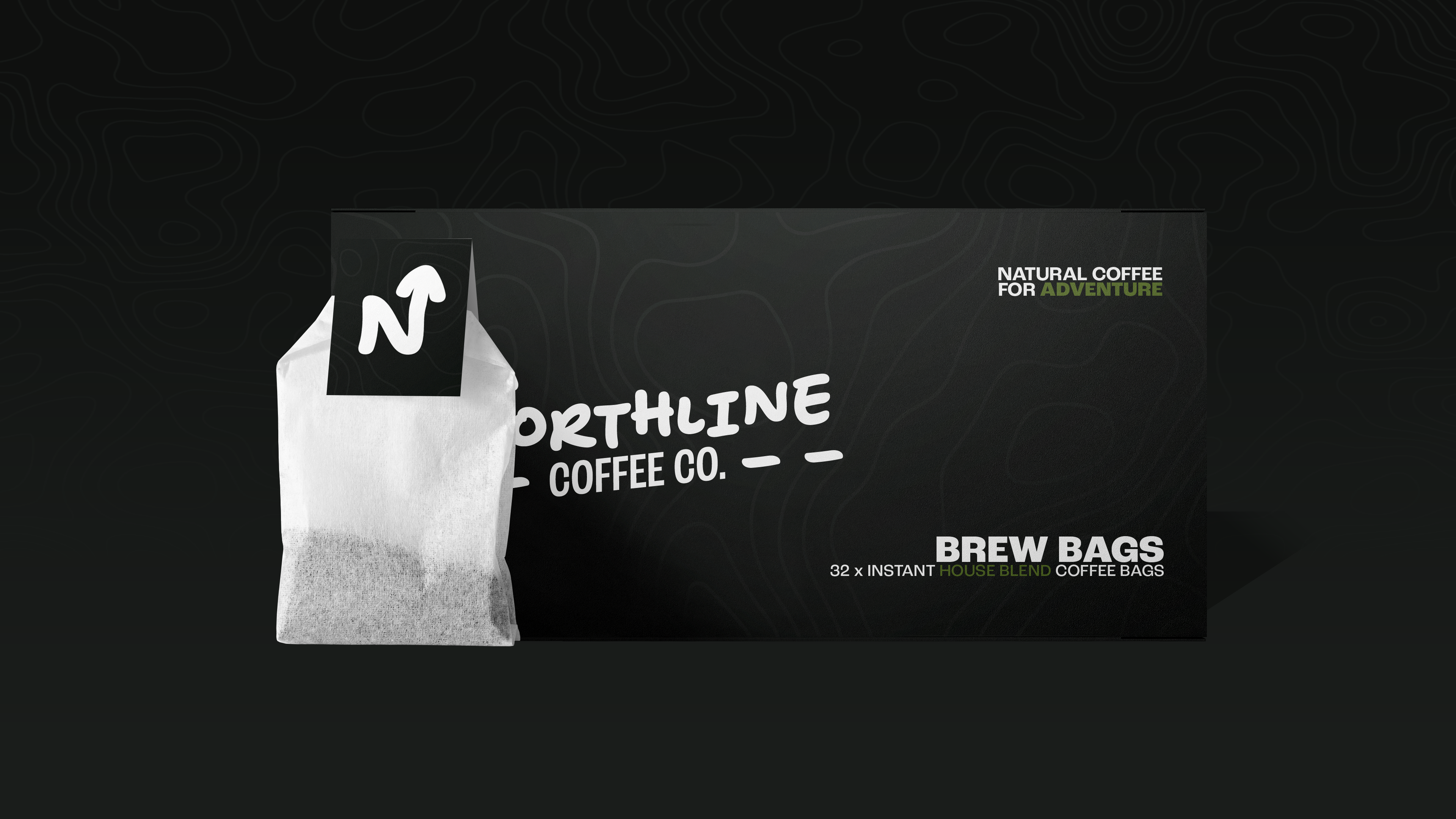
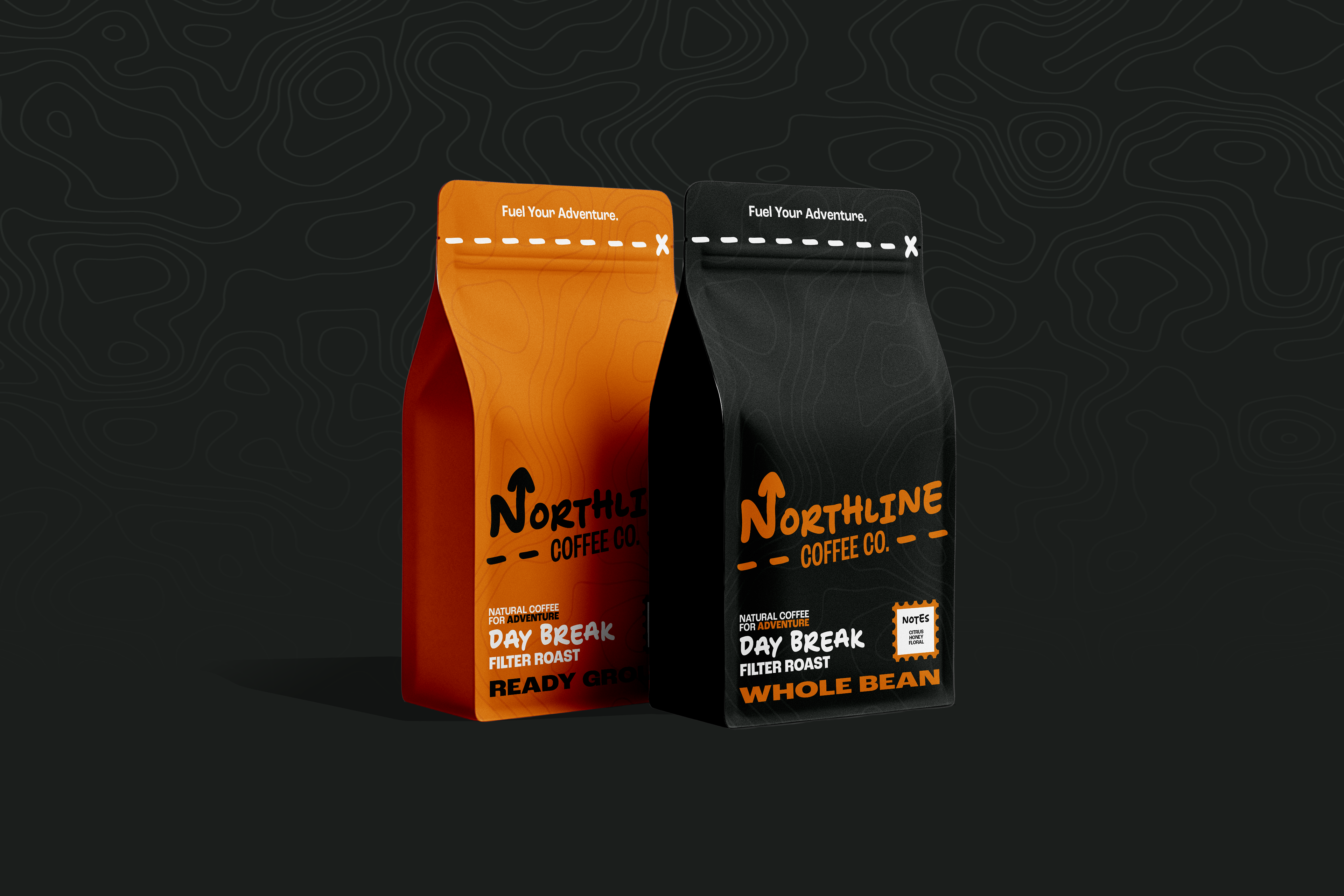
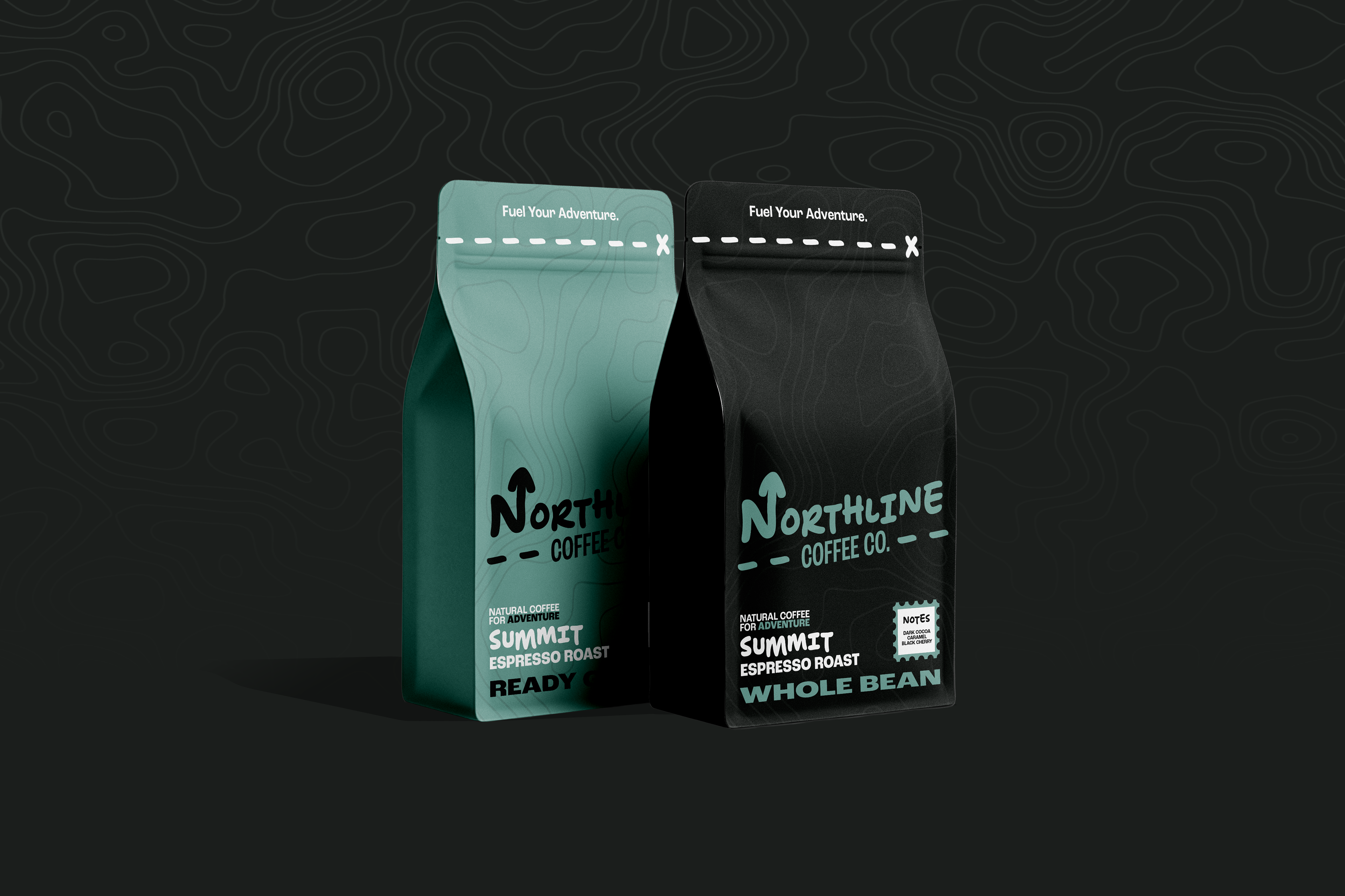
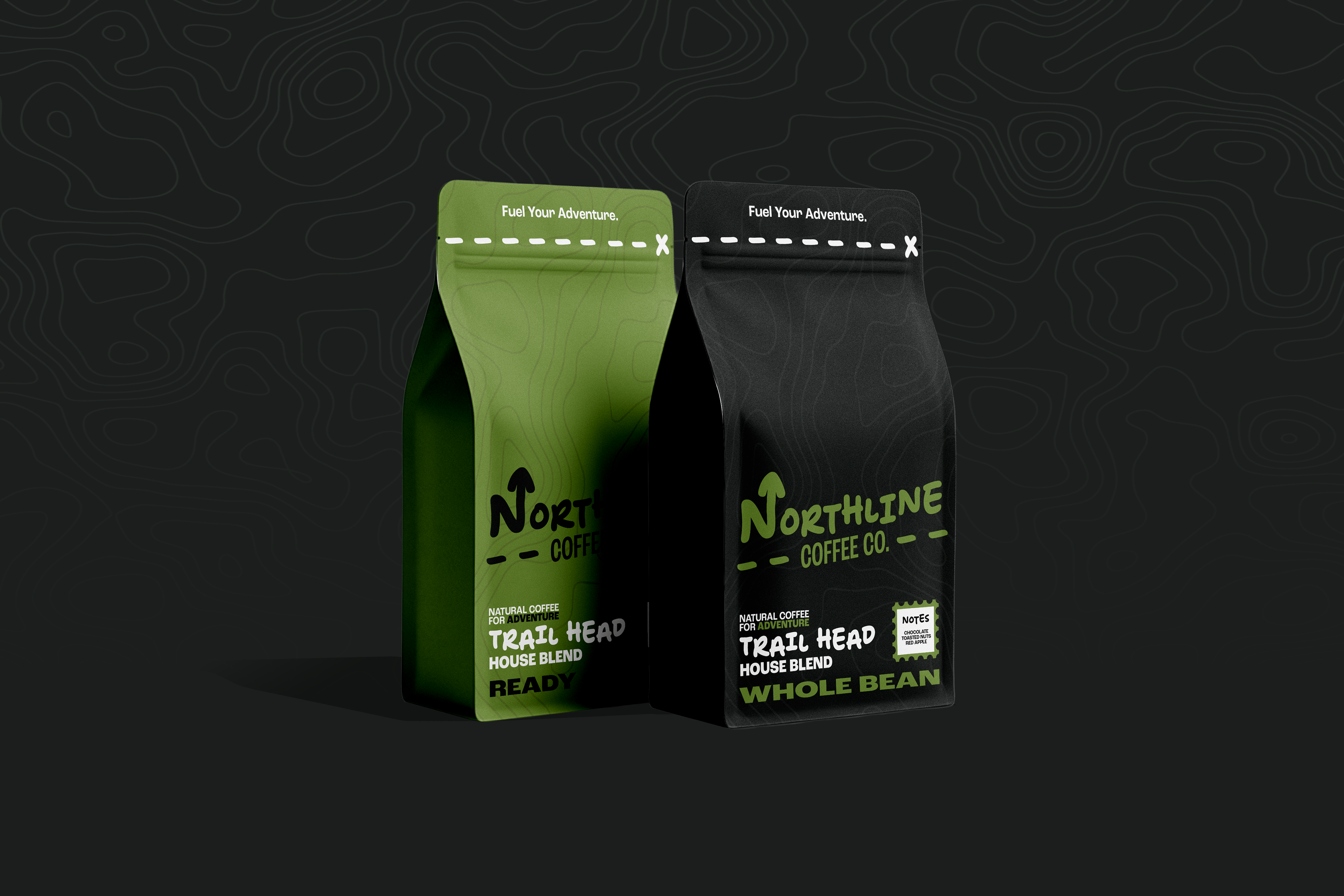
Whole bean coffee bags, ground coffee bags, single-serve coffee brew bags, ready to drink coffee cans and multi boxes for the cans.
Process
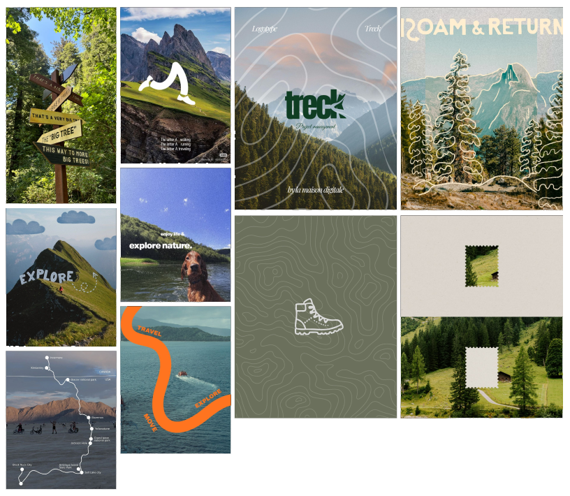
To start the process of creating this brand, my first step was to find images I could associate with the outdoor aesthetic of the brand which avoid the cliché visuals mentioned in the brief. To do this I STARTED BY DOING WORD ASSOCIATION AROUND THE OUTDOORS AND CREATED A LIST OF WORDS OF POTENTIAL VISUALS. the WORDS I decided to explore the visuals of were; Compass, topography, footsteps, trails/trailsigns, arrows/dotted paths, stamps, rivers and canoes.
With these words selected I explored reference images and created a moodboard to direct the design from here. from here I was able to create as many simple sketches of different logo ideas. With these simple sketches I selected a few to expand further into more detailed sketches.
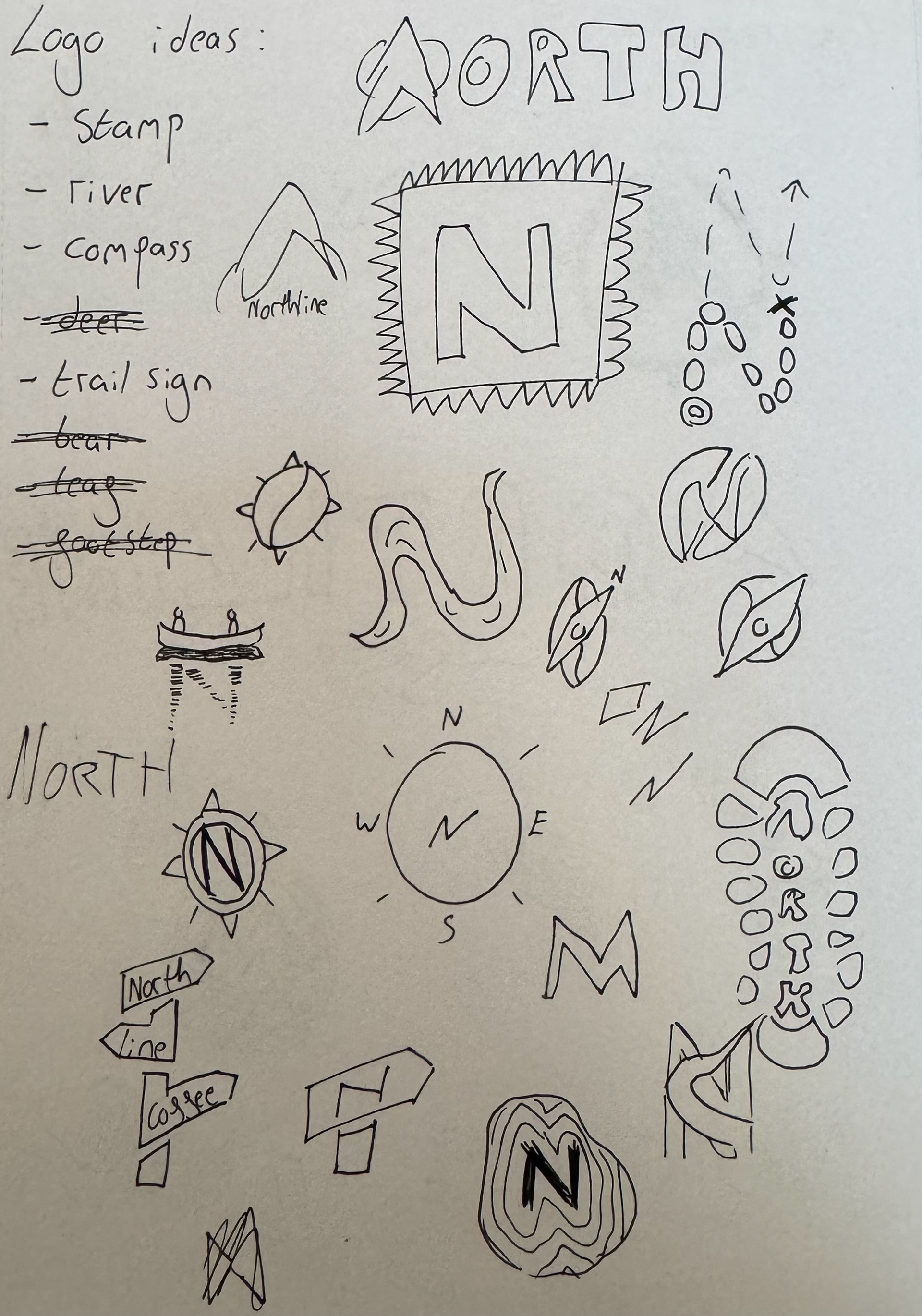
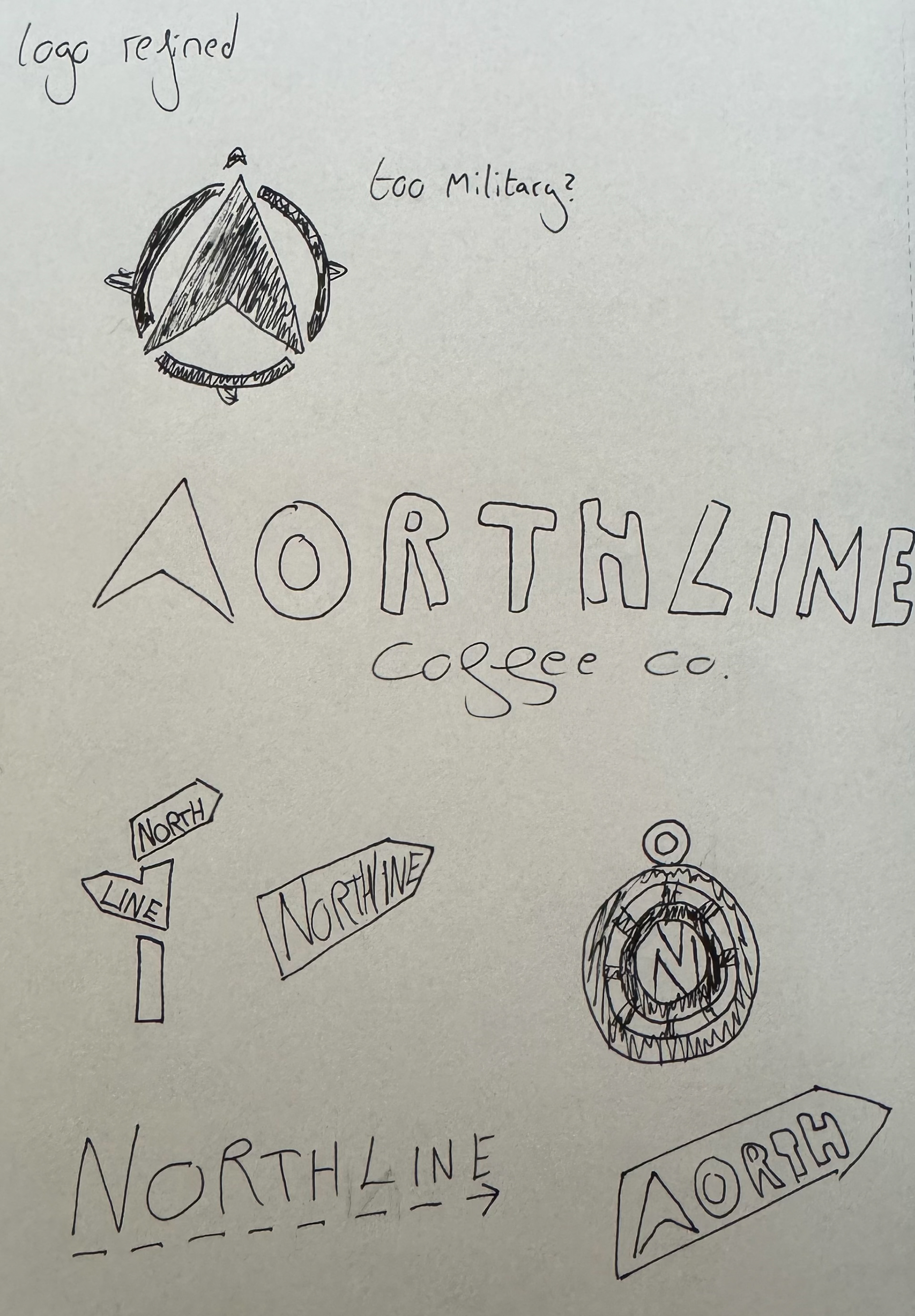
With these sketches created I moved to digital and using illustrator I created a primary logo, wordmark and submark.
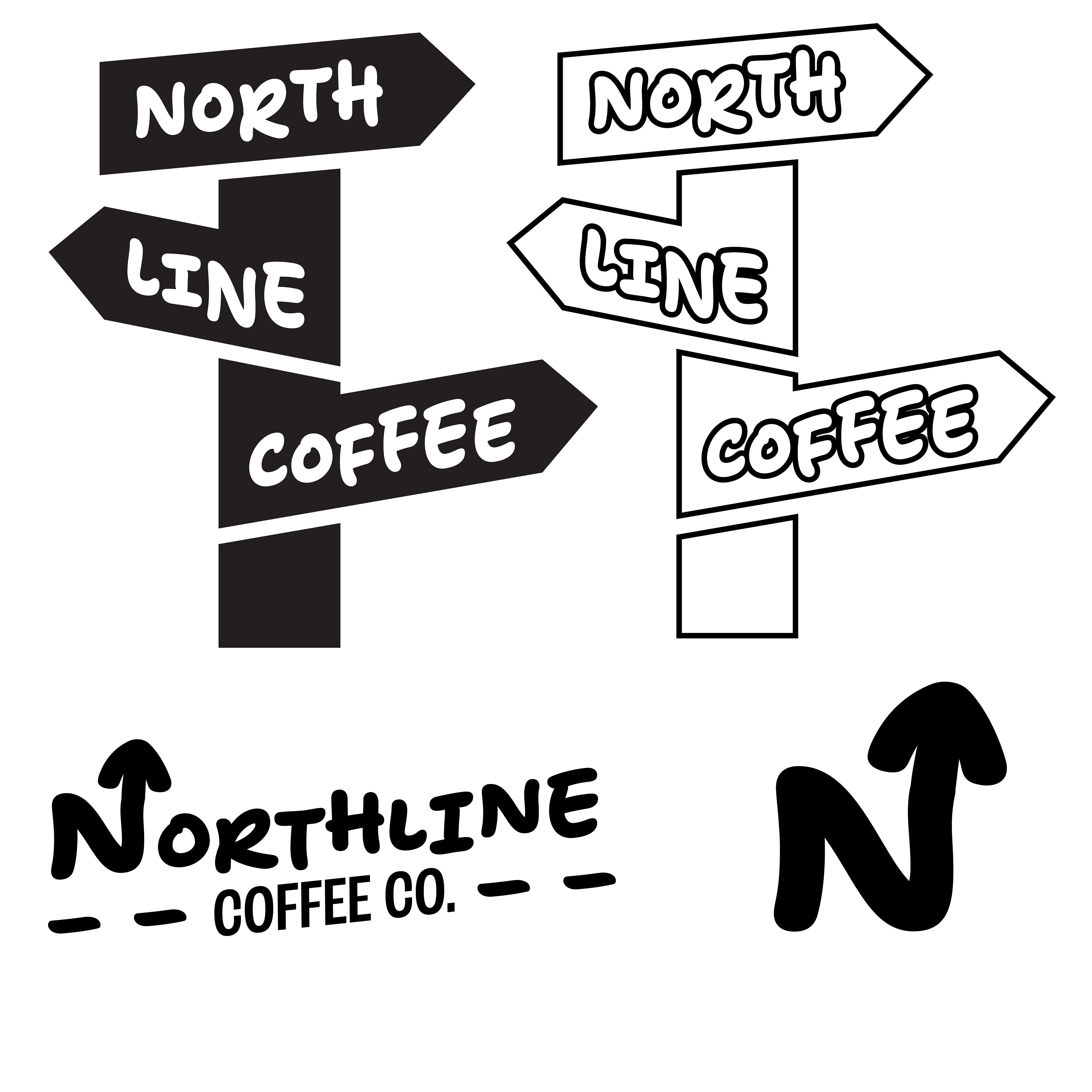
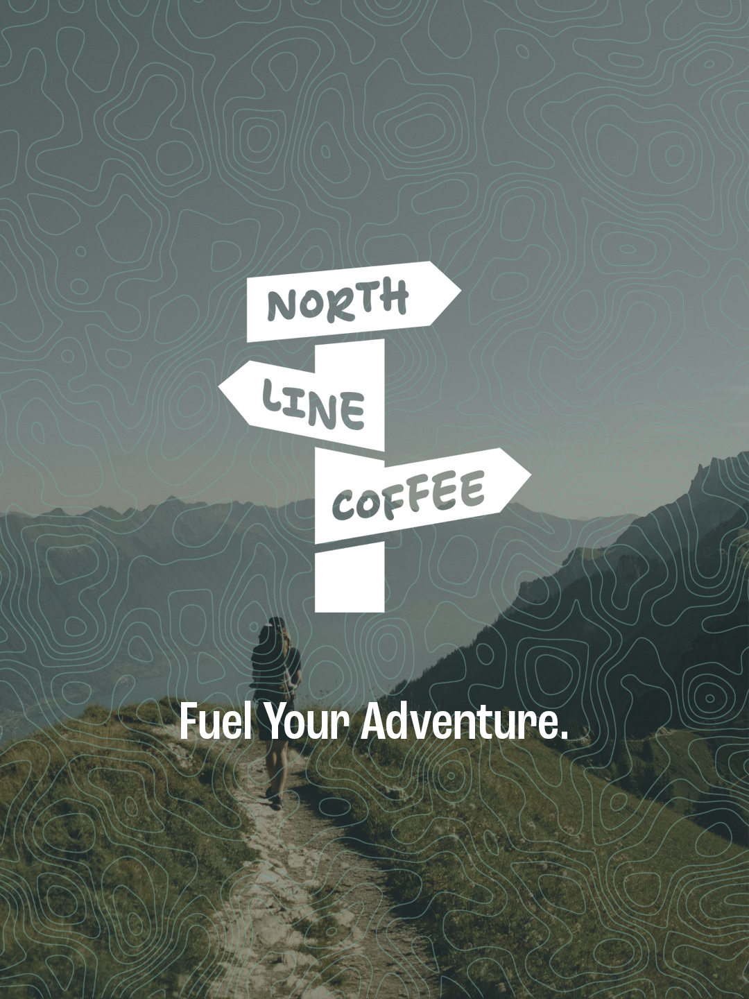
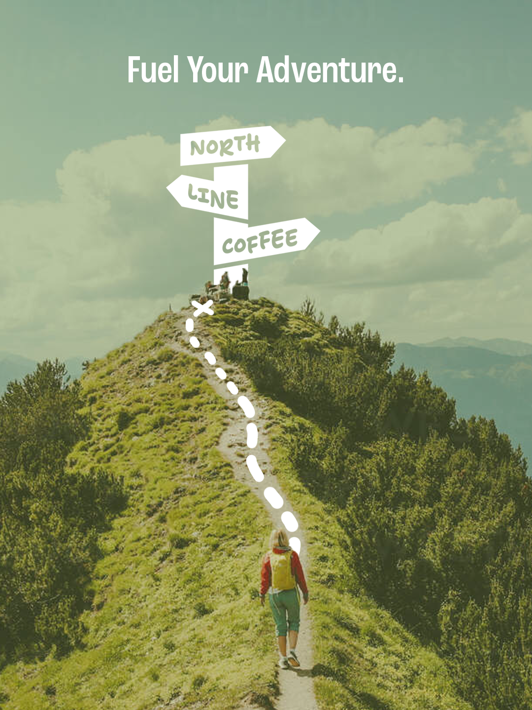
As shown here the main logo created here was inspired by the trail sign sketch. I expanded it to also include the word coffee as with just the word NORTHLINE I thought the logo was too ambiguous and wasn't showing it was a coffee brand.
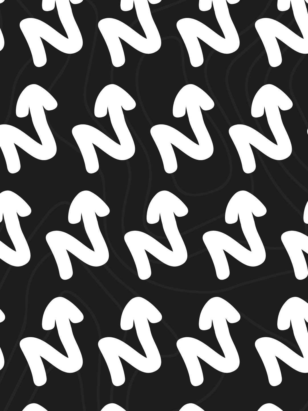
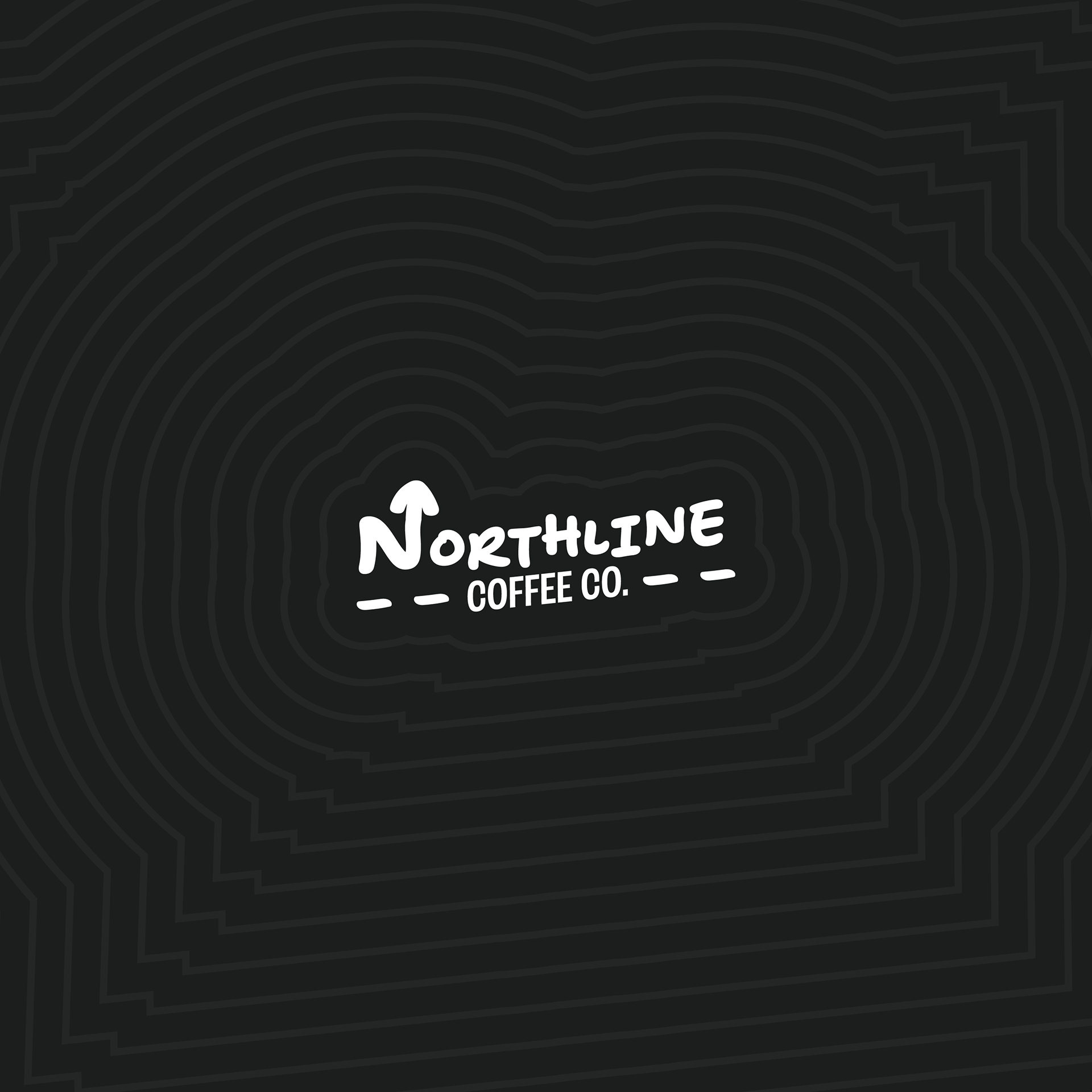
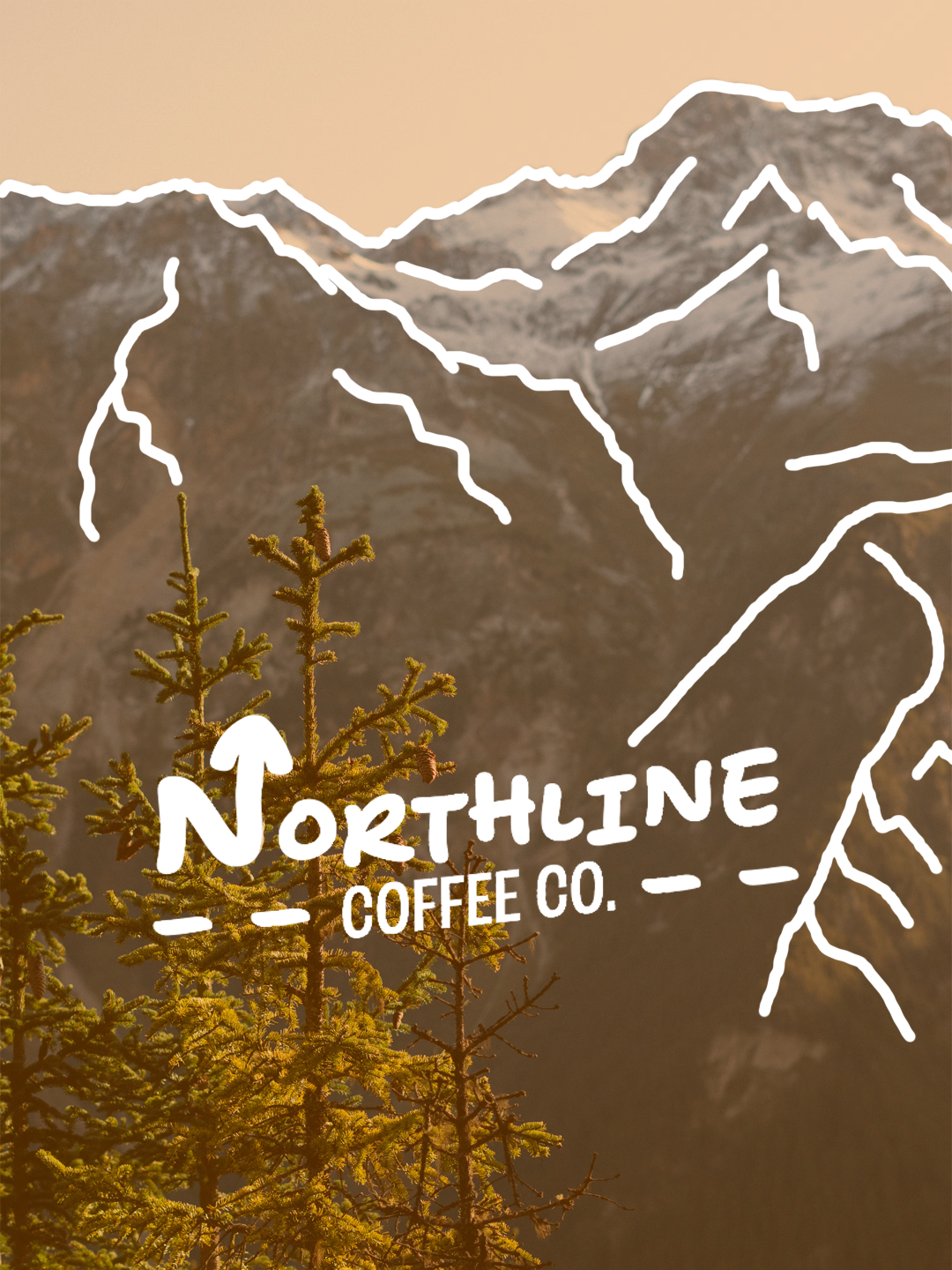
For the word mark I explored the idea of the text with the dotted trail line below it as an underline, however I added the "coffee co." in the middle as a subtext. Additionally, I added the arrow on the end of the n to keep it coherent with the arrows on the trail sign shape. the submark was then made using the n and arrow shape from the wordmark.
for the typeface I wanted to add a bit more of a playful aspect to the brand to make it look more hand drawn or resembling of hand written maps or trail signs. For this I used the font "shantell sans informal bouncy". for a more legible and sensible font to keep the precise and dependable personality, I used the font "ROC grotesk" for the subfont.
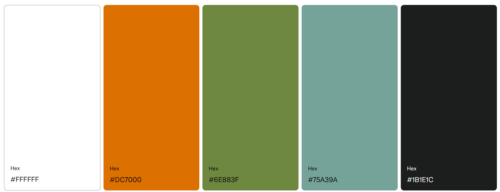
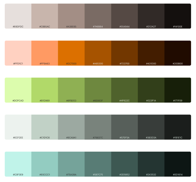
NOw that I had the logo system and typefaces, my final steps to creating the visual identity of the brand was to decide on a colour scheme and decide the patterns and layouts used for the packaging designs. The base colour I used for the packaging was going to be a dark grey with pure white placed on top to create a simple bold colouring. I THEN WANTED TO USE BOLD COLOURS ONTOP OF THIS TO CREATE HIGHLIGHTS FOR THE USE IN FLAVOUR NAMES AND OTHER KEY DETAILS OF THE PACKAGING. tO DO THIS i EXPLORED COLOURS USED IN CAMPING EQUIPMENT. tHIS INCLUDED BRIGHT COLOURS THAT WOULD STAND OUT IN THE WILDERNESS. SUCH AS BRIGHT GREENS, BLUES AND ORANGES. bELOW IS THE SIMPLE AND EXPANDED COLOUR SCHEME i CREATED.
Finally I explored what imagery/patterns could be used for the background or texture for the packaging and advertising. for this i kept the outdoors imagery consistent and decided on the use of topography lines from maps. this was able to be used as a simple understated pattern below text to add more texture to the designs. additionally, i decided on the use of stamp shapes for text boxes to add a little more of a unique shape to an otherwise simple text box shape.
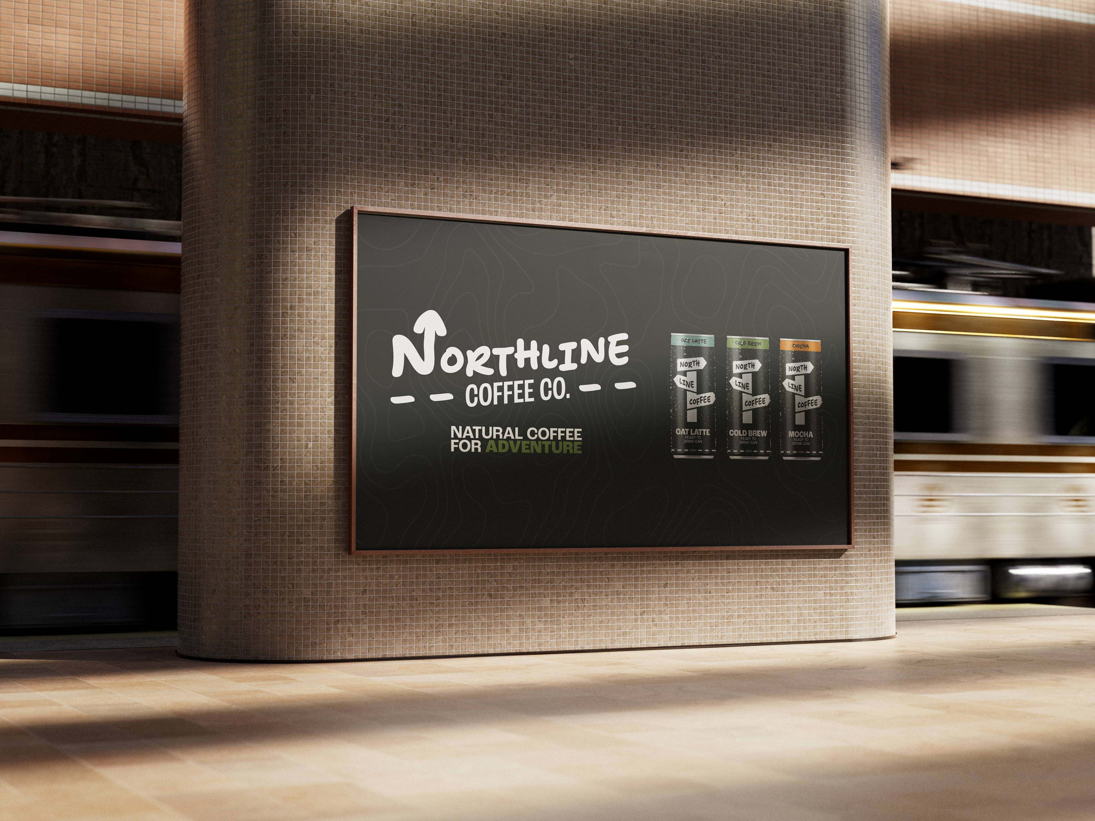
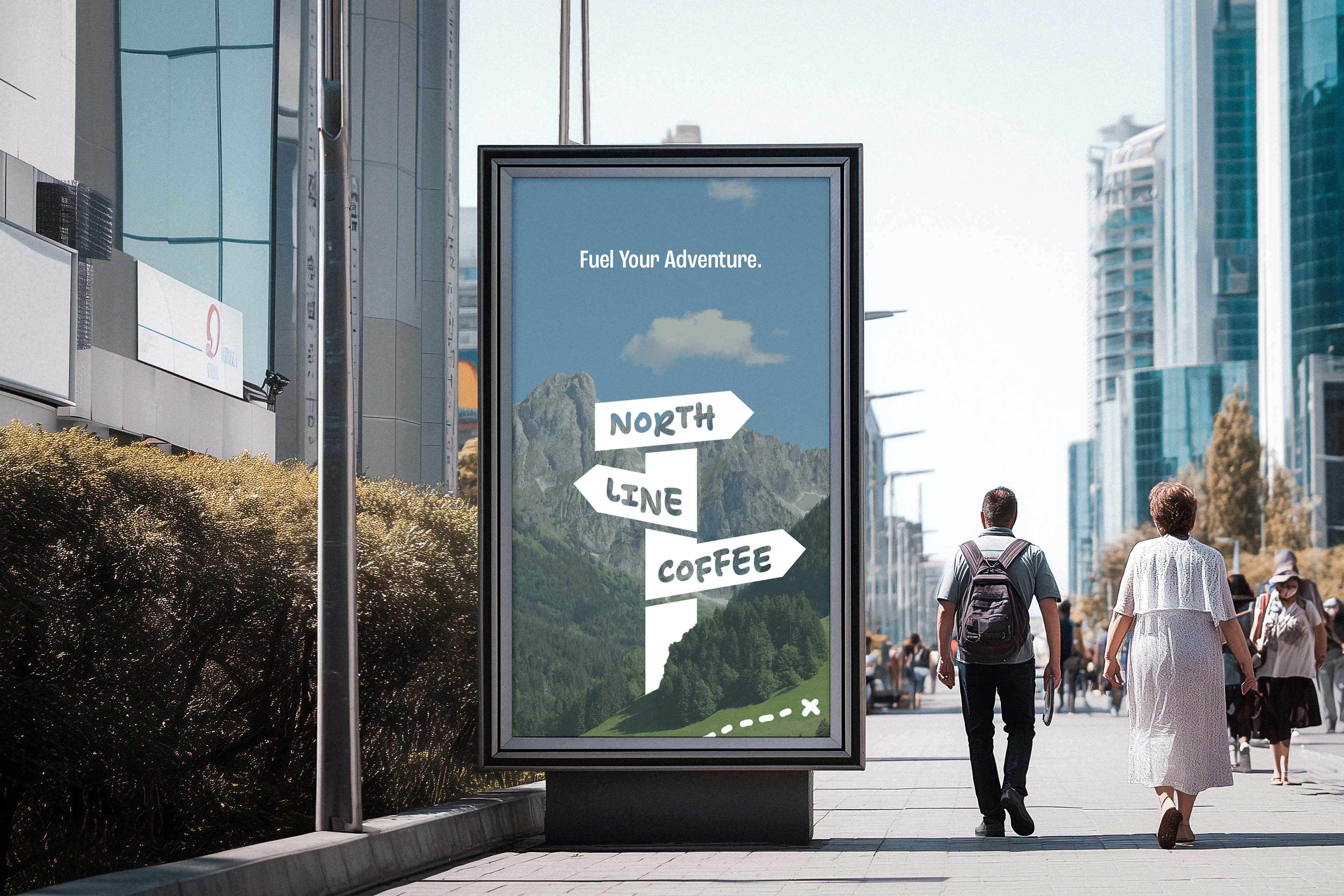
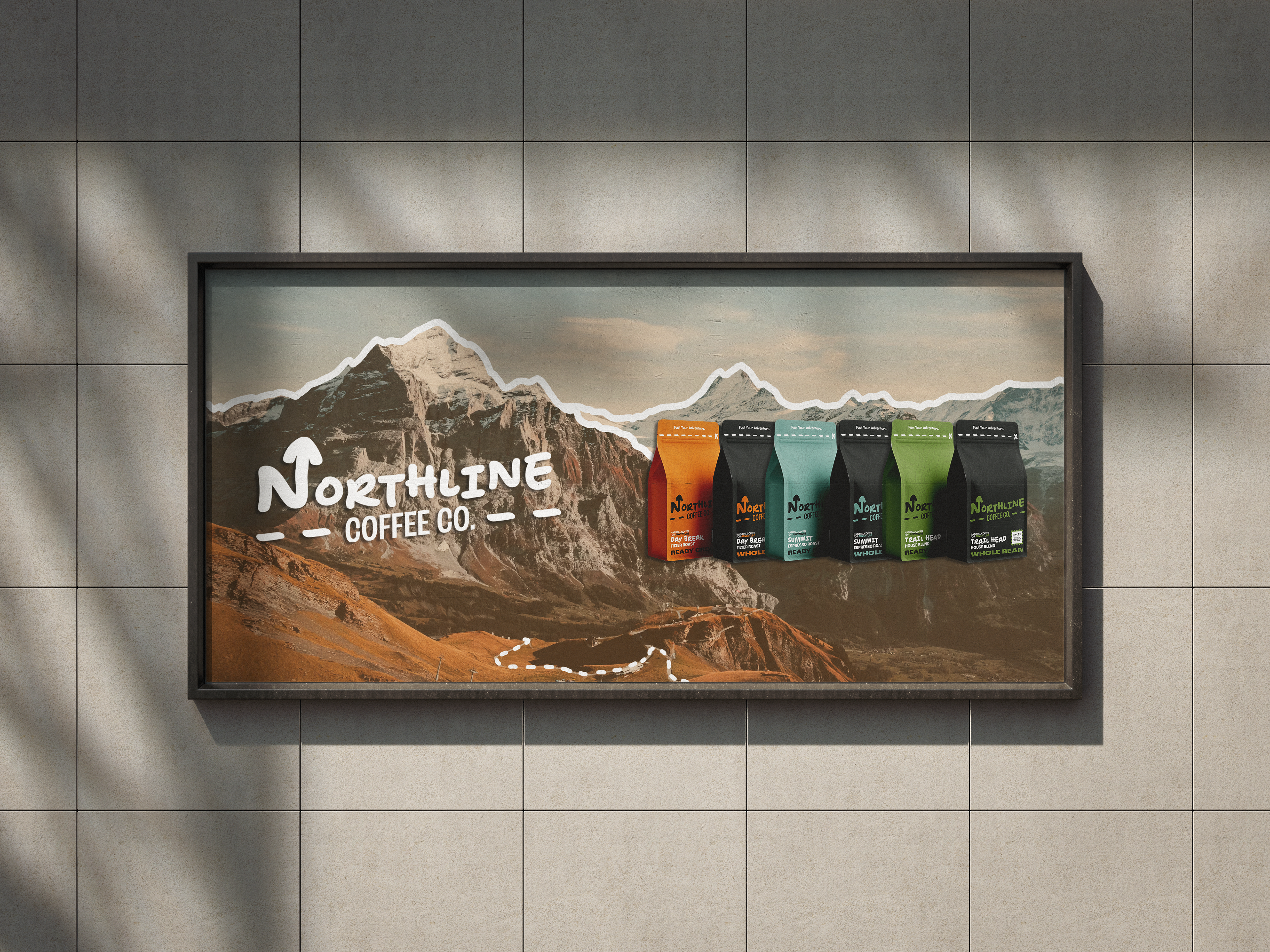
With this visual system defined I was able to start creating packaging, patterns and advertising for the brand
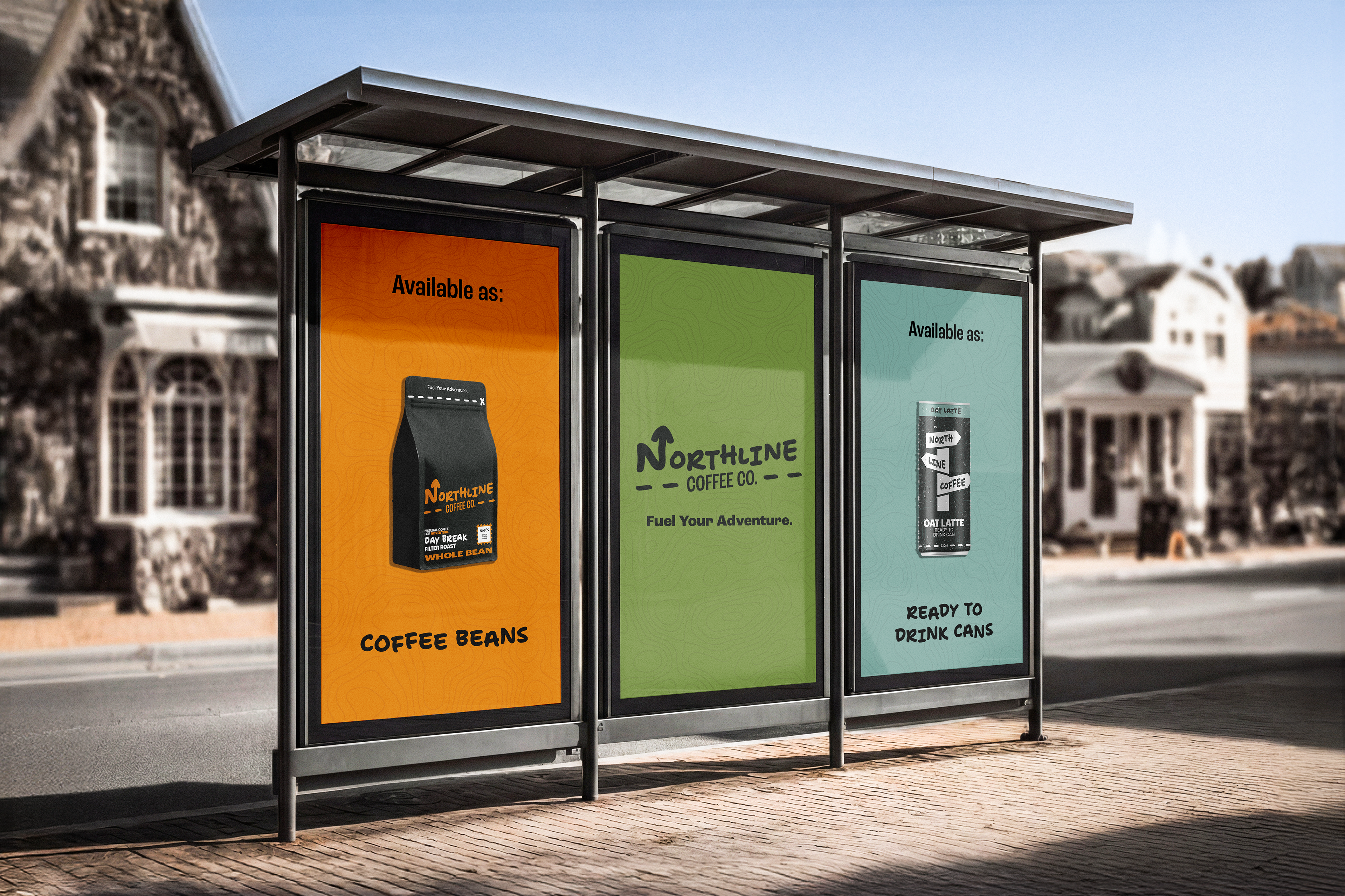
Final product and advertising outcomes